Features
Spotlight
Featured Forums
Brand Forums
Lifestyle
Resources
Patek Philippe: White for me
Well, maybe not exactly for me... but white with black indexes seem to present better the personality of the model.
10Y
0
Patek Philippe: Sorry to say, but...
the 175 collection seems to make us look back. I`d like to understand how the company thinks their developments nowadays.
10Y
0
Patek Philippe: Thanks for asking
I had the same doubt about the hands. It makes me wonder why any watch can be perfect.
10Y
0
Patek Philippe: There are a few differences
Despite the metal: the "Patek Philippe Geneve" has a special room fot it, lower than SS version, as in black/ white version; dial's color seem to me slightly different as well, but that's hard to say without seen it in metal; it`s date window has a metal frame, and, just to mention, it's bezel spots
10Y
1
Patek Philippe: You're welcome, bsodmike,
Caliber 240 is wonderful, but I like 5960 better, despite it's thickness. All black, pink gold/ white dial, original gray anthracide... I can't decide which one is more beautiful.
10Y
2
Patek Philippe: Good point, No Frills
This same situation is happening now with current and recently released 5270 versions. In both cases, this unnecessary change looks for me like spoiling state of art dials.
10Y
0
Patek Philippe: Shriveled 27 and 5
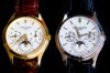
Gentlemen, I would like to invite you to share your impressions about the shriveled numbers 27 and 5 on dials's calendars. I think they never look hamonious, and I wonder if many of you have this same feeling. *** Mod Update *** Picture from user W220 added for illustration. Thank you to W220 for th
10Y
14