
Bill
29416

Always hard to see the details for Non serif dial.
In your picture it is hard to see the E center foot but it has a big serif on the center foot of the E. The easier one yo see is the=on the depth is more to top right of the A while the "pre comex logo dial" the=is more to the left of the A. Also a little hard to see the Comex and the Pre comex logo dial the lume plots touch the minute markers.
Yours looks to be a great example.
Rolex "Pre Comex dial" the diffinitive answer as to the name Pre comex.
I have always struggled with the term PRE Comex. It always struck me as an odd term and I have previously written and said is was just a maxi MK 1 dial. So I did a little more research as I was wearing my PRE Comex over the weekend. I found this on the 55...

Remember it is not a date perspective simple "Pre Comex Logo"
The term means a dial with the same characteristic of the the early 5513 Comex without the logo circa 1969-1972. Pre meaning pre Logo not pre date as before the Comex.
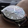
Always hard to see the details for Non serif dial.
In your picture it is hard to see the E center foot but it has a big serif on the center foot of the E. The easier one yo see is the=on the depth is more to top right of the A while the "pre comex logo dial" the=is more to the left of the A. Also a little...