
foversta
[PuristSPro Moderator]
20814

My view of the Patek Philippe 5170G
3 years after the release of the 5170J yellow gold chronograph, Patek Philippe took the opportunity of the 2013 Basel Fair to present its white gold reference. This new version is not just as a mere change of case material. It incorporates an aesthetic change that greatly influences its style when compared to the original version.
When the 5170J was unveiled in 2010, it created some surprises. Indeed, it contrasted sharply from the previous "simple" men's chronograph, the 5070, due to its size (39mm), its strong "vintage" inspiration reinforced by Roman numerals and the yellow gold case. This big aesthetic change was obviously an objective. After all, the 5170J was the first men's watch who used the new in-house chronograph movement, the CH 29-535 PS. It was therefore necessary that the transition between the movements based on the New Lemania ebauche and the manufacture movement was accompanied by this break which symbolizes the beginning of a new page in the history of Patek Philippe.
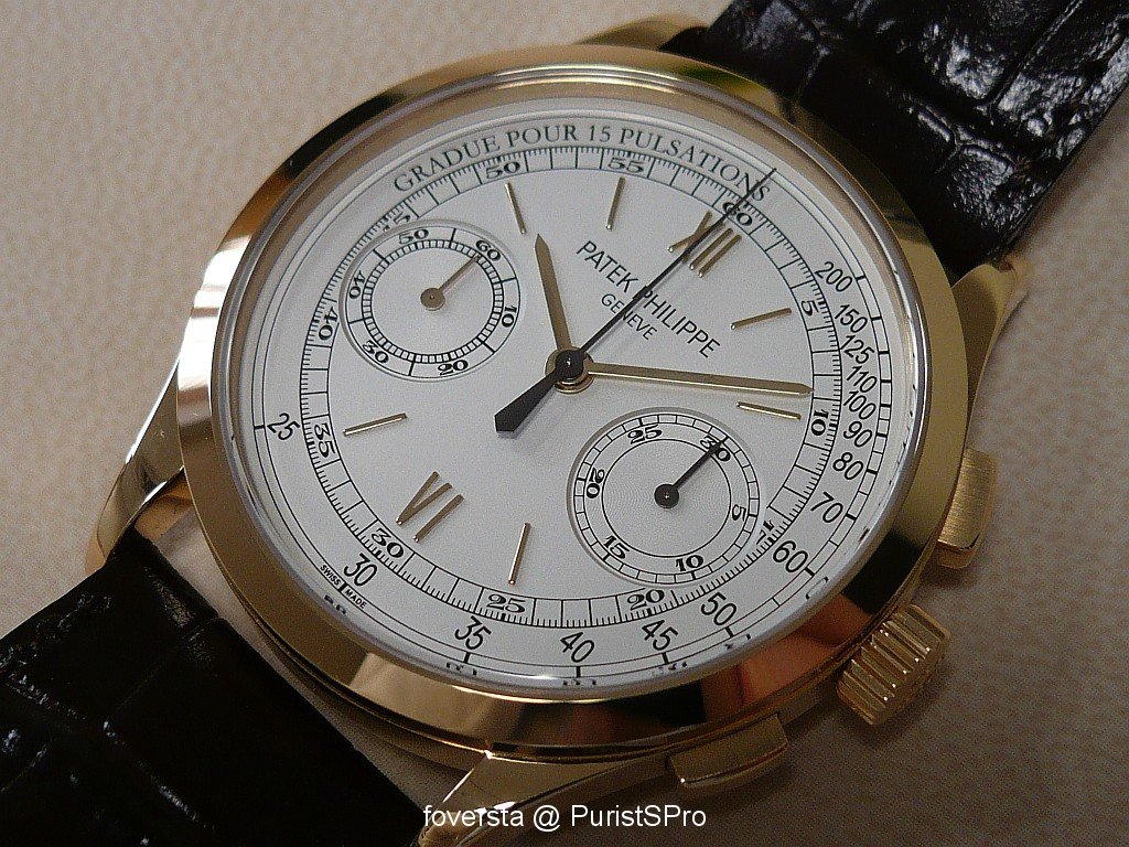
The 5170J features a yellow gold case, two Roman numerals and stick-shaped hour markers:
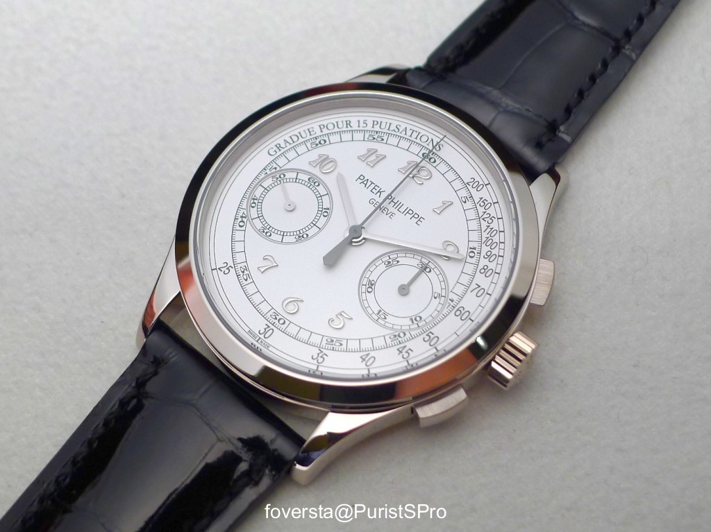
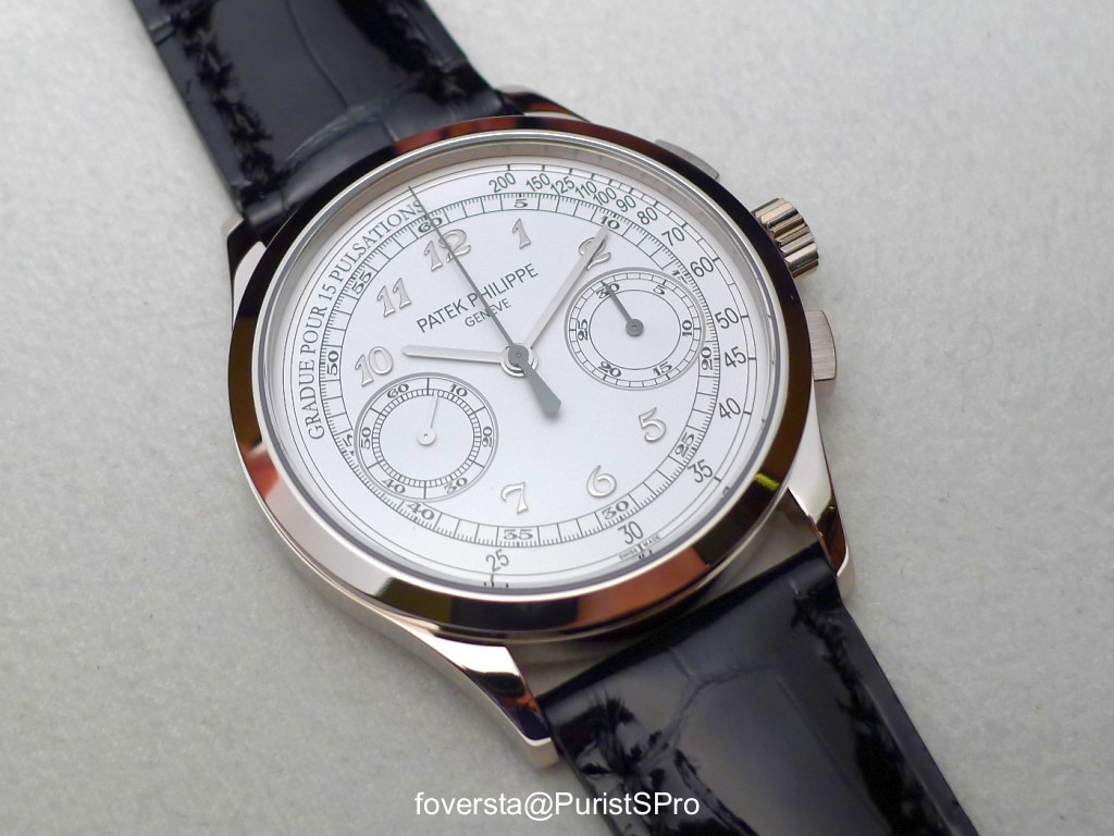
The 5170G features Breguet numerals applied on each available area:
The 5170J is a very elegant chronograph, perfect in a formal context. The need to propose within the collection a more "casual" and versatile classic chronograph has maybe emerged subsequently. This is in my opinion the main purpose of the 5170G.
If we forget its more discrete case color, the main changes brought by the white gold reference can be found on the dial. Its color changes from opaline-white, perfect with the yellow gold case to a brighter silvery-white. And more importantly, both Roman numerals and hour markers were replaced by applied Breguet numerals. This change literally transforms the watch.
While 5170J is clearly inspired by Patek Philippe chronographs of the past, the 5170G, despite a similar basis, falls much more in a contemporary approach. If both Roman numerals of the 5170J which define a vertical axis clearly stand out, the distribution of the seven Breguet numerals of the 5170G along the scale of the chronograph creates a more homogeneous and balanced dial. The applied figures are very refined. Their shape is very elegant and reinforce the perceived quality of the dial.

Finally we are facing two almost opposite watches but that are consistent with their objectives and respective atmospheres. The choice between the two is not easy. I must admit that the discretion, the sober style, the balance and the contemporaneity of the 5170G are very attractive. The warmth and the elegance of the 5170J are also seducing. At the end, I have a slight preference for the latter because the layout of the dial and the pulsometric scale seem to my eyes more faithful to the "vintage" spirit. Maybe Patek Philippe could have used the opportunity of the aesthetic change of the 5170G dial to insert a tachymeter scale instead. This would have reinforced even more the differences between the two chronographs.

The 5170G obviously remains a superb chronograph which takes advantage of the strengths and assets of the original version: the movement diameter that corresponds to the case diameter, the pleasure to use it on a daily basis thanks to a nice winding experience and to the smooth pushers, the instantaneous jumping minutes hand of the chronograph, the 65 hours of power reserve and I will not forget to mention the beautiful architecture of the CH 29-535 PS. The see-through caseback makes us enjoy the curves and the feeling of depth of the movement. I just regret that Patek Philippe has removed some difficulties and I would have liked to see some inward angles.

It is a real pleasure to wear this chronograph. Its moderate size and reasonable weight make it very comfortable. Its simplicity allows us to appreciate the beauty of the applied figures. I also love the dark color of the two hands dedicated to the chronograph function.
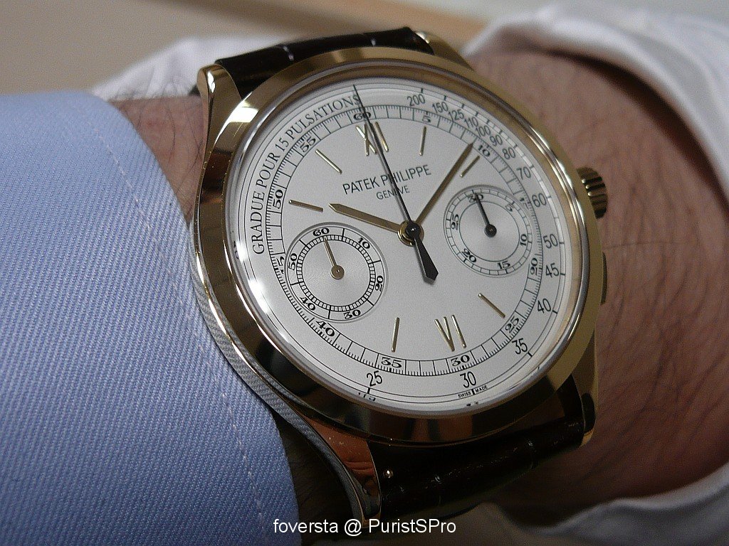
5170G on the wrist:

And the 5170J:
Even if it is a complete novelty, the 5170G has convinced me with its own identity which differs from the yellow gold version one. The use of Breguet figures and the change of case material put this classic chronograph in a more contemporary context and also makes it more versatile.
Pros:
+ the use of Breguet numerals
+ the sober and discreet style
+ the performances of the in-house movement
+ the comfort on the wrist
Cons:
- the shapes of the bridges were cleverly designed, avoiding some decoration difficulties
Thanks to the Patek Philippe team.
When the 5170J was unveiled in 2010, it created some surprises. Indeed, it contrasted sharply from the previous "simple" men's chronograph, the 5070, due to its size (39mm), its strong "vintage" inspiration reinforced by Roman numerals and the yellow gold case. This big aesthetic change was obviously an objective. After all, the 5170J was the first men's watch who used the new in-house chronograph movement, the CH 29-535 PS. It was therefore necessary that the transition between the movements based on the New Lemania ebauche and the manufacture movement was accompanied by this break which symbolizes the beginning of a new page in the history of Patek Philippe.
The 5170J features a yellow gold case, two Roman numerals and stick-shaped hour markers:
The 5170G features Breguet numerals applied on each available area:
The 5170J is a very elegant chronograph, perfect in a formal context. The need to propose within the collection a more "casual" and versatile classic chronograph has maybe emerged subsequently. This is in my opinion the main purpose of the 5170G.
If we forget its more discrete case color, the main changes brought by the white gold reference can be found on the dial. Its color changes from opaline-white, perfect with the yellow gold case to a brighter silvery-white. And more importantly, both Roman numerals and hour markers were replaced by applied Breguet numerals. This change literally transforms the watch.
While 5170J is clearly inspired by Patek Philippe chronographs of the past, the 5170G, despite a similar basis, falls much more in a contemporary approach. If both Roman numerals of the 5170J which define a vertical axis clearly stand out, the distribution of the seven Breguet numerals of the 5170G along the scale of the chronograph creates a more homogeneous and balanced dial. The applied figures are very refined. Their shape is very elegant and reinforce the perceived quality of the dial.
Finally we are facing two almost opposite watches but that are consistent with their objectives and respective atmospheres. The choice between the two is not easy. I must admit that the discretion, the sober style, the balance and the contemporaneity of the 5170G are very attractive. The warmth and the elegance of the 5170J are also seducing. At the end, I have a slight preference for the latter because the layout of the dial and the pulsometric scale seem to my eyes more faithful to the "vintage" spirit. Maybe Patek Philippe could have used the opportunity of the aesthetic change of the 5170G dial to insert a tachymeter scale instead. This would have reinforced even more the differences between the two chronographs.
The 5170G obviously remains a superb chronograph which takes advantage of the strengths and assets of the original version: the movement diameter that corresponds to the case diameter, the pleasure to use it on a daily basis thanks to a nice winding experience and to the smooth pushers, the instantaneous jumping minutes hand of the chronograph, the 65 hours of power reserve and I will not forget to mention the beautiful architecture of the CH 29-535 PS. The see-through caseback makes us enjoy the curves and the feeling of depth of the movement. I just regret that Patek Philippe has removed some difficulties and I would have liked to see some inward angles.
It is a real pleasure to wear this chronograph. Its moderate size and reasonable weight make it very comfortable. Its simplicity allows us to appreciate the beauty of the applied figures. I also love the dark color of the two hands dedicated to the chronograph function.
5170G on the wrist:
And the 5170J:
Even if it is a complete novelty, the 5170G has convinced me with its own identity which differs from the yellow gold version one. The use of Breguet figures and the change of case material put this classic chronograph in a more contemporary context and also makes it more versatile.
Pros:
+ the use of Breguet numerals
+ the sober and discreet style
+ the performances of the in-house movement
+ the comfort on the wrist
Cons:
- the shapes of the bridges were cleverly designed, avoiding some decoration difficulties
Thanks to the Patek Philippe team.
Fx
This message has been edited by foversta on 2013-07-07 13:53:52
More posts:
My view of the Patek Philippe 5170G
3 years after the release of the 5170J yellow gold chronograph, Patek Philippe took the opportunity of the 2013 Basel Fair to present its white gold reference. This new version is not just as a mere change of case material. It incorporates an aesthetic ch...

Beautiful report Fx,
Whilst I like the J more for its elegant spirit,I must say that theG is very appealing too. Can we expect a 5170p with blue dial? Modern classics already. Mo
Thanks Mo!
I tried to imagine a 5170P with a blue dial. I think that this combo works much better with the 5070... it will be difficult to do better! Fx

The breguet
Numerals are to die for. Still warming up to the 5170 as a whole ... The 5070 has a very special place in all of horology and is hard to replace. FX, in terms of refinement, how would u rate the movement vs the previous lemania ? Never been able to have t...
As I said to Sandgroper...
The new movement brings a lot in terms of performance. But there was something very charming in the previous movement: the shape of the bridge, the layout of the movement... Fx

Nice report...
... What we don't really get is the difference of texture with the yellow. On pics feels like a "dead" white that doesn't change with different light situations. Good looking watch though
Thanks for your comments Fricks.
Yes, the subtle differences of the dials are difficult to catch... Fx
Thank you.
I almost know nothing about Patek Philippe. It's articles like this that help novices gain a foundation and appreciation for various houses.

Great report FX and amazing how a slight change can make ...
That much more appealing to me!! I never could warm up to the 5170J but the 5170G gets me at first look! Cheers,
Thanks SteelerFan...
It is the interest of the new version: to create different feelings! Fx

Thank you FX for this very nice post and pictures, my favourite...
is definitely the 5170G, I really love the dial with its Breguet numbers and if on top (well, inside actually) it were to "house" the CH 27-70 based on the Nouvelle Lemania Ebauche.....to me it would be cherry on the cake! I really love that Nouvelle Lema...
Thanks François for your comments.
About the movement, we are facing the half empty / half full glass story. the in-house movement brings a lot in terms of performance but me too, I was seduced by the Nouvelle Lemania based movement. Life is not easy! Fx

The indexes..
Made it perfect on this one.. I have seen the 5170J and i thought the watch looked a bit flat.. But this one with the breguet numeral, made it really beautiful Thanks for the nice photos FX Sam

Thanks FX...........
I agree with you. If I was looking to buy a 5170, than G would most certainly be my choice.
Dear Topcat...
I would hesitate a lot if I had to choose between them... Honestly I don't know! Fx
Thanks Sam!
Sure that the Breguet figures are a nice addition but the indexes have also a kind of depth feeling. I don't consider the 5170J so flat. Thanks! Fx
wonderful post
I miss my 5170j and was excited to see the new 5170g... I think I prefer the breguet numerals and the white case color. Still, I remain more drawn to the new datograph... Regardless, a fantastic timepiece. OpC
Thanks option for your input.
The new Datograph is a very different watch. Larger, heavier, it really depends on what you look for. Thanks! Fx

Thank you very much for the the review!
I also prefer the G, with its much "younger" look. R
Thanks Radone!
I would not say "young" but more contemporary. After all, both watches have vintage roots. ;) Fx

I much prefer the white gold version, BUT...
First, I much prefer the white gold version, not only because I am not a fan of colored gold cases, but also because I find the dial more appealing. One only detail I prefer on the 5170 compared to the 5070 is the case back surrounding the sapphire. I fin...
Thanks for your comments between the two chronographs
If I could afford it, my first choice would be the 5070P with its stunning blue dial. A watch with a lot of character while the 5170 plays a different tune... Thanks! Fx
I have the same impression, amanico
It is a true beauty, nevertheless deserved more detailed features and fine finishing.

Dear FX ...
thanks a lot for sharing your pictures & thoughts on that beaty. I agree, it is a pleasure on the wrist ... ... and I love it when the light starts to play with the shades of the dial and the numerals. Thanks! Oliver ...
Thats a wristshot...
even if the texture of the dial doesn't play with the light, the dial does :) The breguet numerals feel like floating

lovely wrist shot
you really did a great job of capturing the depth and beauty of this watch! thanks for sharing