
amanico
[JLC Moderator]
341473

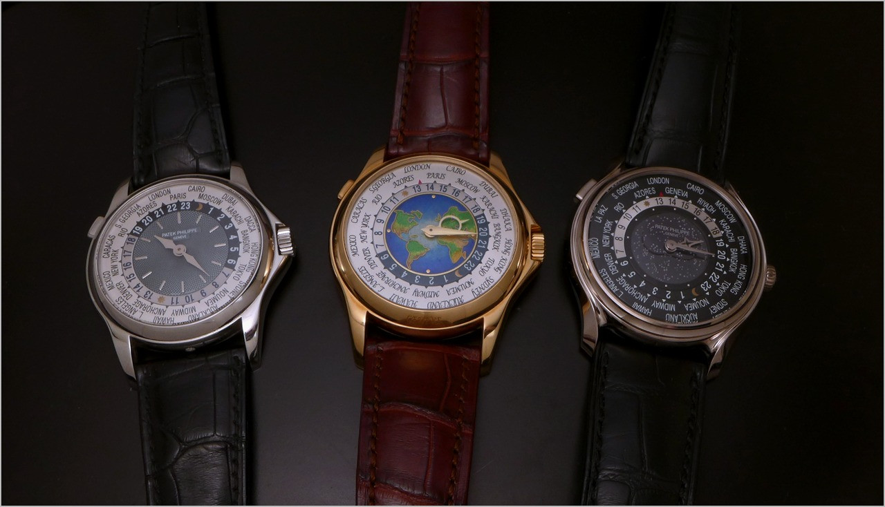
Patek World Time 5575, 175th Anniversary. Thoughts and pictures
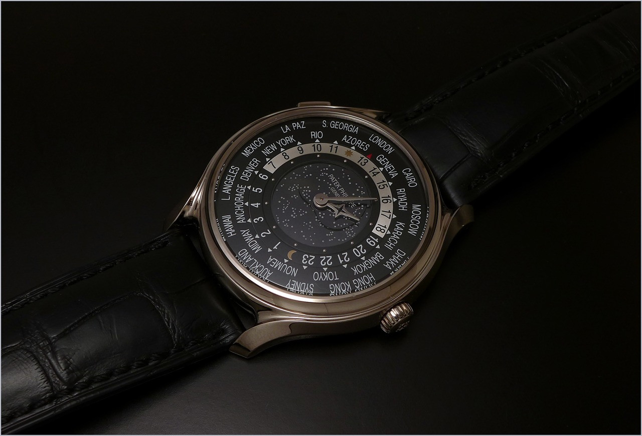
I finally had the opportunity to see it in the flesh.
To say it straight, I was less disappointed than on the first pictures I saw. It is a Watch to be seen in the real, as suspected, if you want to judge it.
The case, which makes you think of the Omega Speedmaster, with its lyre lugs, is less macho, more refined, but maybe a tad too mannered for my taste, as well as the decoration of the buckle.
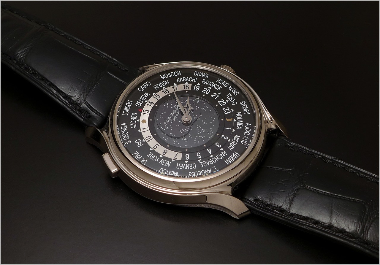
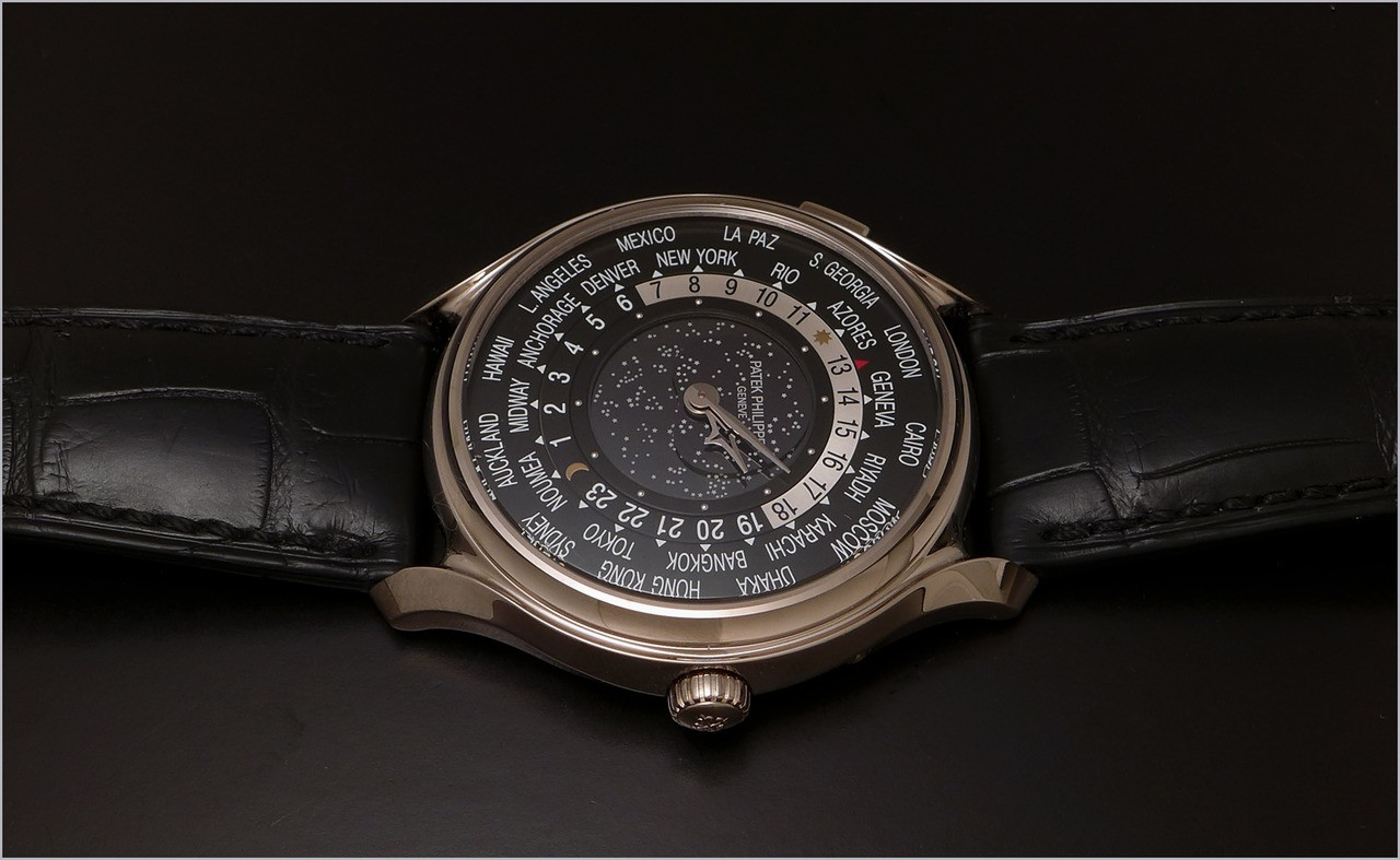
The choice of a black dial is an excellent idea, for this world time, as it gives a delicious strenght to this world time The starry sky adds a atouch of elegance and poetry.
Now, the bump hiding the moonphase is a bit weird, even if it is well done, as expected, but it ruins a bit the center part of this dial, in my opinion.
The moon is beautifully made, but you will have to set it, if you don't wear the 5575 for a while, which is a problem for every moonphase not linked to a perpetual chronograph. And to set it requires that you find a dedicated site on the net, to tell you what is the correct moonphase... Not very practical.
I regret that Patek didn't opt for a bigger dial. The dimensions seem to be the same than on the 5130, which were the same than on the 5110, but since the first version, which was 37 mm big, the case gained 2, 8 mm.
So, like with the 5130, Patek enlarged the ring of the cities of the world, but didn't change the diameter of the center part of the dial, which makes it look smaller and breaks the coherence we had on the 5110.
A missed opportunity to re think the proportions of the dial, since we have a new case, which is sad, in my world time radical fan opinion.
Now the hands... I must say that I am crazy about them. We had the spade hands on the 5110, the cissor hands on the 5130. Now we have these ones, on the 5575. And they are delicious.
The legibility? Well.... Since we admire time more than we read it, not really a problem.
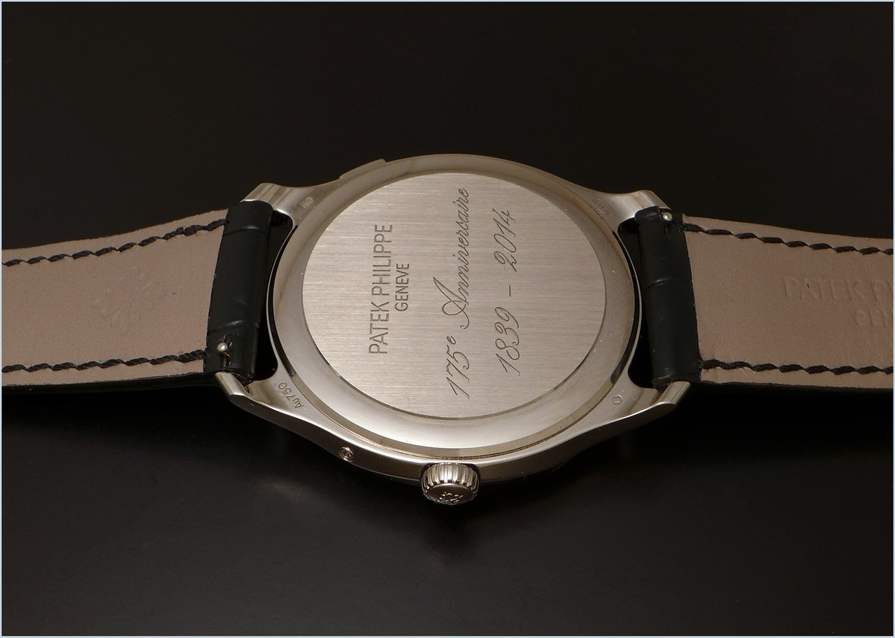
The solid case back? Not a problem. The Cal 240 HU is pleasant to see, but nothing extraordinary, here, so why not a solid case back. The good solution would have been to go for a " hunter " case back, which would give you the possibility to see the movement " à la demande ", but it would enhance the thickness of the case. So... A wrong good idea?
The fact that it is limited to 1300 pièces is not a big deal. If Patek decides to launch this reference in different metals ( yellow gold, rose gold and platinum ) it may not be that exclusive.
So you go for it because you love it, not for its exclusivity ( 1300 pièces is not really exclusive, by the way ).
Yes, finally, seeing it in the real confrimed my first intuition. Not a bad Watch, better in the flesh than on pictures, but I expected something more.... Consistant, maybe.
So, if I had to do a hierarchy, I would say that my first choice would be the 5110, my second choice would be the 5131, and my last choice would be this 5575.
Here are the promised pictures, thanks to the kindness of its owner.
And a family picture, to conclude in beauty:
Best,
Nicolas
This message has been edited by amanico on 2014-12-04 00:03:23 This message has been edited by amanico on 2014-12-04 00:07:00
More posts:
Patek World Time 5575, 175th Anniversary. Thoughts and pictures
I finally had the opportunity to see it in the flesh. To say it straight, I was less disappointed than on the first pictures I saw. It is a Watch to be seen in the real, as suspected, if you want to judge it. The case, which makes you think of the Omega S...
Nicholas, your version on the left is by far the more
beautiful one. The 175th version does not even hold a candle next to your one.

Thanks Nico,
I feel easier now. I decided not to stalk the watch because of readability. At the same time a small devil inside was asking me if I should have jumped for this as it was an Anniversary Piece. I am stalking some other, more exciting things now and it look...

Thank you for report and family picture ;)
That last shot is an excellent overview and first comparison shot I'm aware of Funny 5575 on your shots is during new moon Coincidence or necessity? :) Best Damjan
Coincidence. It was the exact moonphase when the pictures were taken.
As for the family picture, one is missing, the 5130, but I was able to take one series of pictures, which I will post later... Best, Nicolas

Thank you for the excellent report
This is a model that i have always loved. In this version, what i most like is the case and the shape of the lugs, in addition to the "starry night". I would ask for three dots of lume on the inner bezels (at Geneva, on the Sun and on the Moon) and on the...

Nice, practical review....when I AD asked me for my wishlist...
on the 175th anniversary pieces, I told him I do not have anything that strikes me most that I must have. Thank you for the clear summary, Nico. Rgds Raymond

Thank you Nicolas...........
Nice writing and beautiful pictures...as usual:) My pick is the 5110P by far the more balanced in my opinion and I don't really like the kind of enamel "a la" 5131. Cheers Francois
You have to see the 5131 in the flesh. It is an impressive watch.
But I would not trade my 511°P for it... As for the 5575, well, less disappointing in the real, I must confess, but not at the point to consider getting one. I am a happy guy with my 5110P. ;) Best, Nicolas
Anyway
5110p is of course discontinued 5575g is sold out And now, it's quite official, 5131 is discontinued So on the last pic, we have a trio of vintage Patek

Good review Nico !! Glad to see your some of your views differs from
others' and mine on the 5575. These differences are what PuristS should provide in order for each other to gain a better understanding of various angles in considering this piece. For me, the curves on the sides of the case is what makes it more "sexy" / ...
Different points of view are great.
If we all agreed on a Watch ,it would be boresome and not very constructive. The 5575 has soem good and bad points and the global feeling will differ from one to another. It is a bit subjective. And as an extrem fan of the Patek World Time, I have a level...

Nicolas, there is a great deal I like about this watch..each time i see it...BUT...
.....when i try it on, I find a new experience. It is its presence on the wrist and its aesthetic that is so special. It "looks" unlike any watch I know on the wrist.
no...but i would trade a 5131G for this one...
......we are of course ignoring the financial equation...but which do i prefer...5131 or 5575? The latter.
No Go for me as the Moscow time is wrong
And I would never trade my 5131G for 5575....
i wish i would never had this NO GO opinion re this watch
as i like the overall look on my wrist and artezan craftmanship of this beauty. But, as i mentioned, this fault with the Moscow time zone was main reason not for go. I am buying watch not for collection in the safe but to wear it and travel with it if its...

The more I think about
The fact that all the anniversary world timers have dials which are blatantly inaccurate, The more I question the reasoning behind their release in this form. This complication focuses specifically on world time zones, and frankly i am quite surprised tha...
Hi H, Interesting comments! My thoughts for Patek and me as an owner are...
For Patek, the rings for the cities were made before Moscow revised back to its previous time zone and were produced in "time" for the 175th. If Patek were to re-make the rings, the roll out the 5575 would be off with the rest. Hence, a commercial call on...
Dear Gordon
Firstly, congratulations on your Anniversary WT! May you always wear it In good health. Thank you for your reply and insights, which I agree with in some parts. The timezone switch first occurred in November 2009 in Russia. It was an experiment that laste...
Hi H, great suggestion on ...
"the opportunity to install a correct dial should be made available free of charge to owners should they wish" An offer like this by Patek would bring a lot of goodwill to the 5575 owners and Patek collectors generally. Cheers, Gordon
I think Patek should keep Moscow where it is now...
5575 is a commemorative 175 anniversary piece produced in 2014. I think therefore as such, it should have Moscow time zone where it was in 2014. It makes it even more interesting and unique reflecting extra piece of history in 2014. Thus, Patek did the ri...
Hi Carnegie, other owners may want to change the dial, but for me, I
want this piece of history !!

And today my friend my AD called and mine was in so for me love and happy!
One must see in person to tuely appreciate it's beauty. The dial is spectacular and watch has an uber cool feel to it. I am over the moon over it and glad I was fortunate to get one as here in States they are very hard to come by and demand sky high. Chee...
I'm So happy for you my friend
we have to meet ourselves and make a nice pic of our beauties

I gota say...
when I first saw some of the pics, I thought, eh... it's a little "stealthy" for me making it hard to read. But your "real world" pics, well that changes my mind. That wrist shot brings out the beauty of this anniversary edition. I'll have to see it for m...
Ken....
......when i say i understand "completely" what you mean, I really do mean "completely" LoL I find this a very alluring and attractive watch. Its aesthetic is intoxicating.
My question to you is this.....
If you forget the horological logic of case size, movement size and limited editions........ Is the 5575G the most aesthetically gorgeous watch on the wrist between the 5110G, 5131G, 5130G and 5575G? Which one looks like the "killer on the wrist?" I am ta...
Now I know to who I will propose my 5575
if I want to sell it Very funny the comparison between girlfriend and wife, but... It's my wife who convinced me to take it at the Patek event so... And as usual, she was right because it's really a very elegant and "personal" watch and fortunately, I don...
there would be no point in offering me a 5575.....
........ .....always great when one's wife proposes a watch.
That is one of the most expensive Xmas Tree I know! :)))
Have a superb moment in family, my friend. Nicolas
Thanks Nicolas!
For the amazing review. I do agree that little bump to hide the moon is kind of weird. That said, I think I'm poisoned on the 5110 now. Oh no! ;)